
Transformations / Product & Web
A product whose whole promise is calm, launching into a category that sells noise.
The Challenge
You cannot argue for calm
on a page that shouts.
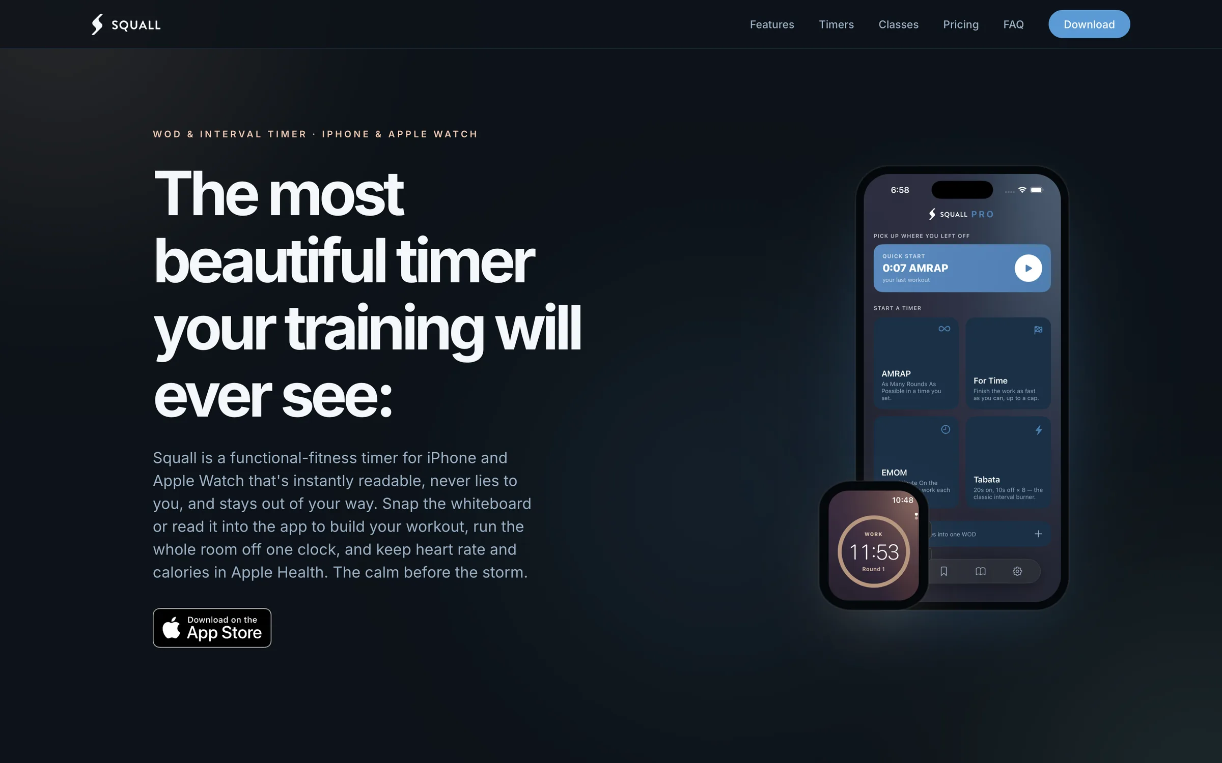
Squall is a WOD and interval timer for iPhone and Apple Watch, and it is our own product — which made us our own client, with all the discomfort that implies. The category it was launching into is loud and crowded. Timers with ads between rounds. Feature lists three screens deep. Stock photography of somebody mid-burpee. Nearly every site in the space competes the same way, by turning the volume up, and the effect is that they all sound identical.
The app's argument is the exact opposite of that. Readable, honest, invisible — a timer calm enough to disappear into the workout. But nobody downloads an argument they haven't felt. The decision to try a timer is made on a page, in a handful of seconds, long before anyone runs a round with it. A loud site would have disproved the product in the first scroll. So the problem was never how to describe Squall. It was how to make a web page behave the way the app behaves.
The Approach
Show the product being calm.
Don't claim it.
The line the entire page hangs on was already sitting inside the product.
The calm before the storm.
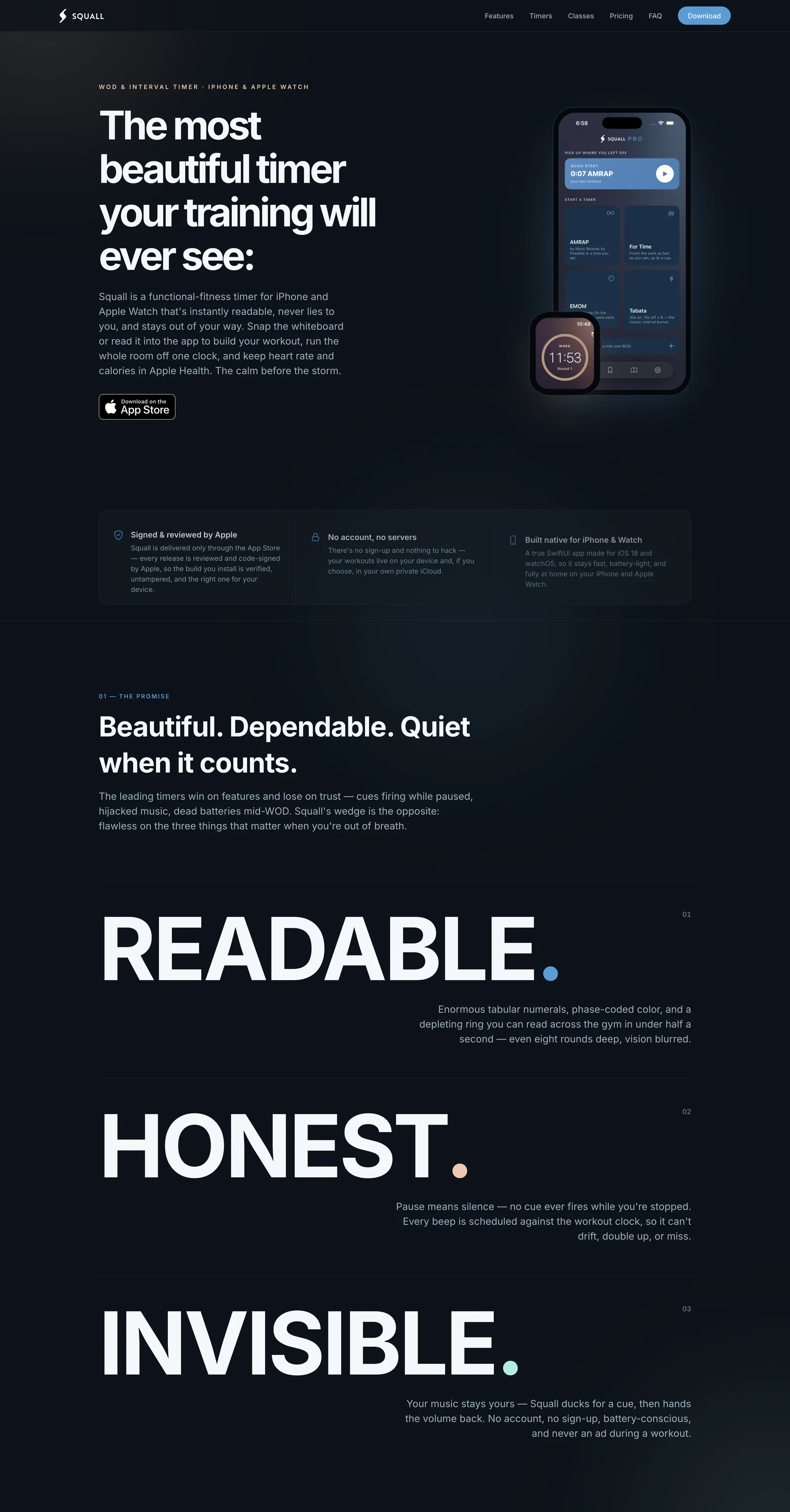
Five words that set the tone for every decision after them. The surface went dark and stayed dark, with a slow aurora drifting behind it that echoes the mesh gradients the app floods the screen with mid-workout. One idea per screen, generous space around it, and type doing most of the work. Nothing on the page moves faster than the product does.
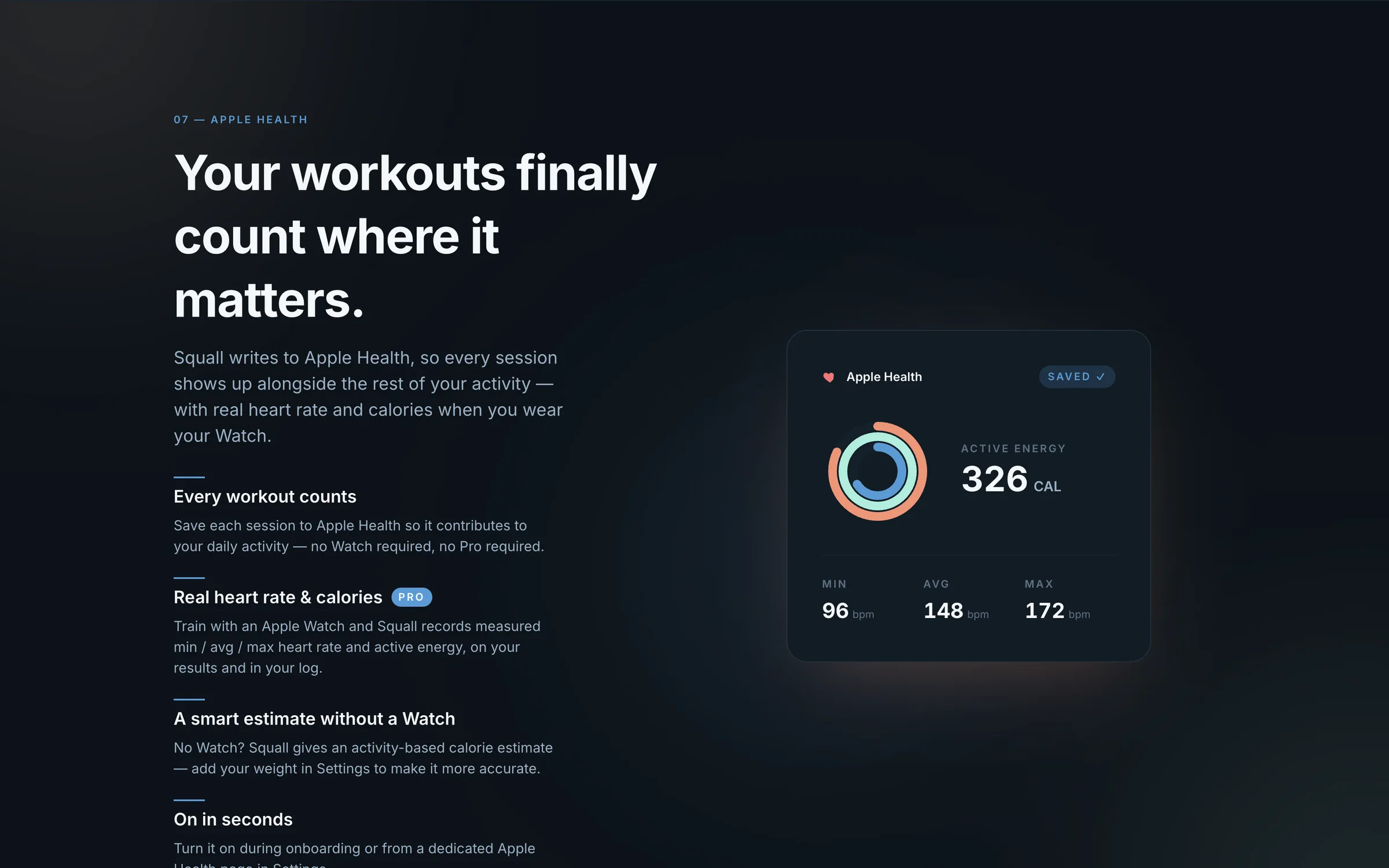
Then we refused to describe anything we could show instead. Every screen on the site is the real app — the actual clock faces, the Watch running a countdown on a wrist, the leaderboard laid out on a gym TV, a live demo of a workout running. A timer is a thing you look at while you're out of breath, so the only honest way to sell one is to let people look at it.
The promise itself is stated in three words at full page width — READABLE. HONEST. INVISIBLE. — each one followed by a single sentence of evidence rather than a paragraph of adjectives. Naming a standard that plainly is a risk: it invites the reader to check. That was the point. Every claim on the page is one the app can be held to, and the copy stays specific enough to be falsifiable.
That honesty had to survive the commercial sections, which is usually where product sites start hedging. Pricing states plainly what is free and what isn't. The FAQ answers what athletes actually ask — whether it interrupts their music, whether there are ads during a workout, whether they need an account, what it does to the battery — instead of the questions that flatter the product. Underneath, every pinned and animated section has a static fallback for reduced motion, because a site claiming reliability has to be reliable for everyone who lands on it.
The Result
The page keeps the same promise
the product does.
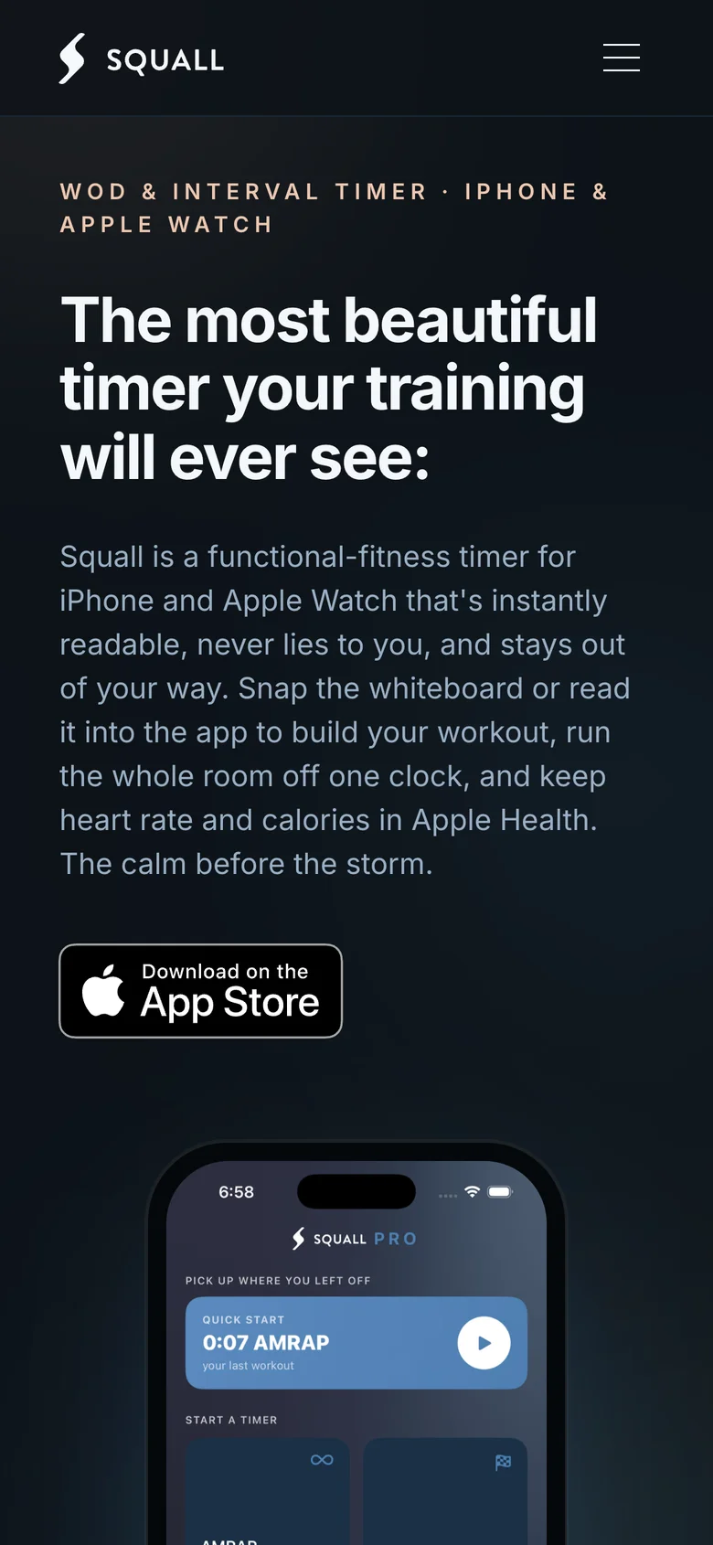
Squall launched worldwide on the App Store with the site live alongside it — a page that does the one job a product site has, which is to make the decision easy for the right person and honest for everyone else. An athlete can see the timer they'd be training with, read what it will and won't do, and know the price before they tap anything.
It is also the plainest statement of our standard we can make. There was no client to convince, no budget to defend, and nobody to blame for a compromise. We held our own product to the line we hold client work to, and the site is the evidence.
The product's whole argument was restraint.
So the site had to make it without raising its voice.
More Transformations
More transformations in the making.
Every engagement earns its place here once the story can be told honestly — the gap, the work, and what actually changed. New transformations will appear as they reach that mark.
If this resonated,
your business deserves the same attention.
The first conversation is always free. And it's always about your business, not ours.