The Thinking
One Shape to Rule Them All
Sam's Club and the logic of system-first branding.
When Sam's Club unveiled its first identity overhaul in nearly two decades, the internet did what the internet does. The new logo "could be any company." It looked like a fintech startup, a budget airline, a mattress brand — anything but the cavernous, pallet-stacked warehouse where Americans buy rotisserie chickens by the armful. Within hours the app-icon swap had its own grievance threads. The verdict formed fast and hardened faster: generic.
It's worth sitting with that word, because it's doing two jobs at once. As an insult, it's lazy — the reflexive complaint that greets every rebrand the moment a familiar thing changes. But as a description, it's almost precise. The new Sam's Club really does share its DNA with a hundred other modern marks: the lowercase wordmark, the geometric symbol, the friendly sans-serif sanded free of anything sharp. If you were asked to draw "a 2025 rebrand" from memory, you might draw something close to this.
So the easy article writes itself — another heritage brand flattened into the great beige sameness — and it would be wrong. Not wrong about what the logo looks like. Wrong about what the logo is. Because spend an hour with the actual system Turner Duckworth built, and you find something most of the angry quote-tweets missed: this isn't a logo that was simplified. It's a logo that was engineered — grown outward from a single shape until the symbol, the letterforms, even the apostrophe in "sam's" all share the same geometric source code.
That's the tension worth a whole essay. The craft here is real, and so is the genericness — and they're not in opposition. They're the same decision, seen from two distances. This is the story of what Sam's Club actually built, why it looks like everything else, and why those two facts have almost nothing to do with each other.
The craft here is real, and so is the genericness. They're the same decision, seen from two distances.
What the old logo was carrying
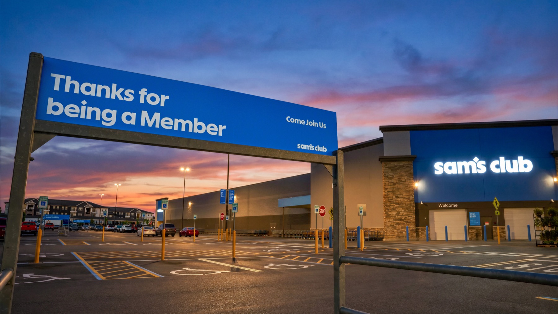
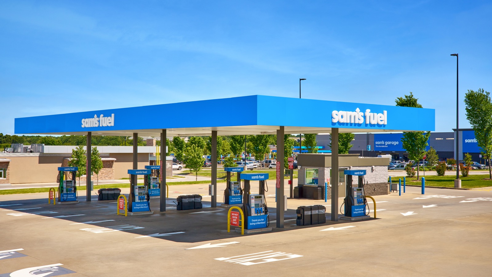
To judge a rebrand you have to know the brief, and the brief is always hidden inside the thing being replaced. The outgoing Sam's Club logo had real equity. The diamond had been part of the mark since 1994; three decades is long enough that a shape stops being a design choice and becomes a fact of the landscape, like a road sign. Members didn't read the old logo so much as recognize it from the parking lot. That recognition is worth money, and any honest redesign has to decide what to keep of it.
But the old mark was also carrying liabilities it could no longer afford. It was built for a world of storefronts and circulars, not app tiles and avatars. Its proportions were horizontal and dense; shrink it to the size of a phone icon and it turned to mud. It was a logo — a single fixed artifact — in an era that demands a system, a set of parts that can recompose themselves for a billboard, a browser tab, a tote bag, and a 16-pixel favicon without ever looking like compromises.
So the real brief wasn't "make it modern." It was harder than that: modernize a thirty-year-old asset for a digital-first membership business without throwing away the one shape every member already knows. Keep the diamond. Make it work everywhere. That constraint is the key to everything Turner Duckworth did next — and to why the result looks both inevitable and, to some eyes, anonymous.
The diamond as source code
Start with the thing everyone glossed over: the diamond is not decoration. It is the source code.
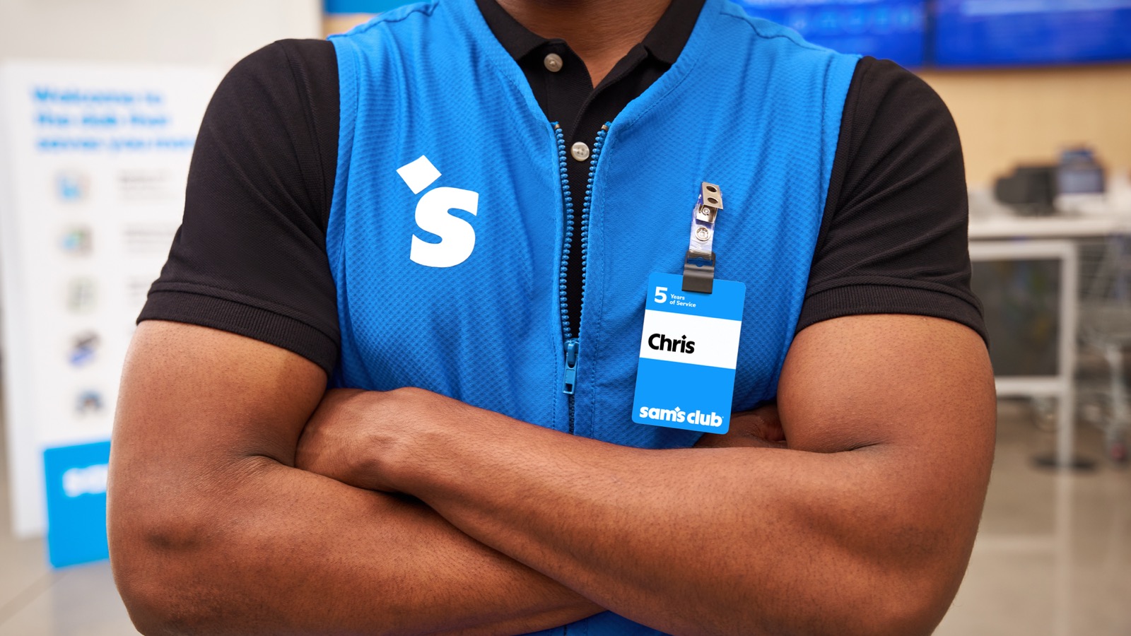
Look at the wordmark and you'll catch the move. In "sam's," the apostrophe isn't an apostrophe — it's a small diamond, set high and tucked between the m and the s. A lesser rebrand bolts a symbol onto a name and calls it a lockup. This one threads the symbol through the name, so the mark can't be separated from its own punctuation. The diamond isn't standing next to the brand; it's load-bearing inside it.
From that single shape, the studio built outward. The standalone symbol — two brackets resolving into a diamond — carries the brand where the full wordmark can't fit: the app tile, the social avatar, the corner of a screen. This is the part the "could-be-anyone" crowd missed, because it only becomes visible across touchpoints. A logo lives in one place. A system propagates.
The clearest proof of that propagation is the typeface. Sam's Club didn't license a sans-serif; it commissioned one — Sam Sans — and then did the thing that separates a system from a coat of paint: it carved the diamond into the punctuation. Set a line of it large and the evidence is right there in the marks most designers treat as afterthoughts. The full stops aren't dots — they're tiny diamonds. The apostrophe is a diamond. The dot of the exclamation point, the tittle over an i: diamonds, every one. Punctuation is where a typeface's personality usually goes to hide; here it's where the brand's whole logic surfaces.
That's the detail that reframes everything. The letters and the symbol aren't merely compatible; they share a vocabulary, and that vocabulary is the diamond. When the type and the mark are cut from one idea, every headline, price tag, and aisle sign quietly reinforces the symbol without ever showing it. The brand becomes legible even when the logo is nowhere on the page.
This is what real system design looks like in 2025: not a logo you admire, but a grammar you can't quite see — a single decision, this shape, compounded across a thousand surfaces until consistency stops being a guideline and becomes a kind of physics. You can dislike the result. What you can't honestly call it is lazy.
Why it looks like everything else
Here is where we have to give the critics their due, because they're describing something true. The new Sam's Club really does belong to a family. Lowercase wordmark, geometric symbol, warm and rounded sans-serif: this is the house style of the late-2010s-into-2020s rebrand, the look that swept fintech, then telecom, then fashion, then fast food, and has now reached the warehouse club. When people say it "could be anyone," they mean it has the accent of its decade. They're right.
But notice why the convergence happens, because it isn't fashion — or it isn't only fashion. It's a response to forces every brand now shares. A logo today has to survive at 48 pixels on a home screen, animate cleanly in a six-second pre-roll, hold contrast against a dark-mode background, and read the same on a billboard and a browser tab. Serifs clog at small sizes. Idiosyncrasy resists animation. Ornament fails accessibility contrast. Run a thirty-year-old wordmark through those constraints and it will emerge looking a lot like its neighbors — not because the designers lacked nerve, but because they were all solving the same equation with the same variables.
So the convergence is, in a strict sense, rational. And it carries a consequence that the backlash never quite states: distinctiveness has moved. It has migrated off the logo and into everything around it — motion, color, voice, the texture of the retail experience, the typeface doing its quiet structural work. The mark converging toward the mean isn't the failure. It's the cost of admission. The real question is what a brand does with the distinctiveness it relocated.
Distinctiveness has moved. It has migrated off the logo and into everything around it.
So is it generic, or just relocated?
This is the crux, and it deserves a verdict rather than a shrug.
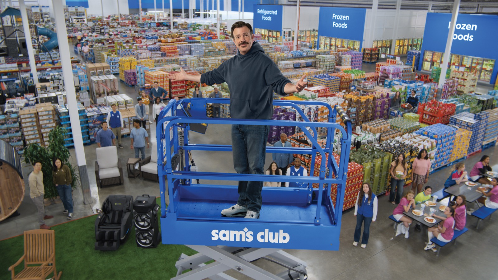
The case for the defense is genuine. Sam Sans is not a generic choice; a bespoke typeface built from the brand's own geometry is precisely the kind of distinctiveness that the logo gave up — distributed across every word the brand sets instead of concentrated in one mark. And the launch leaned warm where the geometry runs cool: the "Come Join Us" campaign, fronted by Jason Sudeikis, supplies personality, humor, a human face — exactly the register a diamond and a lowercase b cannot supply on their own. Seen this way, the system is working as designed. The logo went quiet so the rest could get loud.
But the prosecution has a real witness too, and we shouldn't dismiss it to protect a tidy thesis. Strip away the typeface and the celebrity, and ask what's left to tell Sam's Club apart from any other blue, friendly, geometric retailer. The color is a bright blue that a dozen competitors could claim. The symbol, away from the wordmark, is a clean abstract shape with no obvious tie to this business. Much of the differentiation rides on Sam Sans — and a typeface, however well-made, is a subtle instrument. Most members will never consciously register it. If the distinctiveness was relocated, a fair amount of it was relocated somewhere most people won't look.
So here is the verdict, and it tries to be honest in both directions: this is a strong system wearing an under-distinct expression. The architecture is excellent — disciplined, generative, built correctly for the surfaces it has to live on. But outside of Sam Sans, the expression doesn't yet reach the level of the engineering. The typeface is doing more than its share of the brand's heavy lifting, and a brand that leans this hard on a tool most people can't name is taking a real bet. The bones are right. Whether the public ever feels the difference will depend on what gets built on those bones over the next two years — not on the logo that started the argument.
The tell: a strategy that predates the logo
If you want evidence that this was strategy and not a coat of paint, don't look at the masterbrand — look down the shelf at Member's Mark.
Back in 2022, well before any of this, Sam's Club recast its private label as a "purpose-driven brand," complete with a new checkmark mark and the tagline Made with Our Members and Planet in Mind. That was years before the diamond got its overhaul. Which tells you the rebrand we're dissecting wasn't a sudden cosmetic impulse; it was the company's logic finally arriving at the top of the house. Sam's Club had been systematizing — sharpening its sub-brands, attaching meaning to marks, thinking in identity rather than logo — for years. The 2025 masterbrand is that habit reaching the front door.
That's the difference between a rebrand and a refresh. A refresh changes how the brand looks. A rebrand is the visible edge of a company that already changed how it thinks, and has been changing for a while. The diamond is just the part you can see from the parking lot.
A refresh changes how the brand looks. A rebrand is the visible edge of a company that already changed how it thinks.
What this predicts
Which is why the launch-day logo reveal is the least informative moment in the whole exercise — the one we should trust least, even as it generates the most noise. A reveal shows you a single frame of a system designed to move. It tells you almost nothing about whether the thing works, because the work happens later, in the compounding: across ten thousand price tags and app screens and delivery boxes, in whether Sam Sans accrues the recognition it's betting on, in whether the warmth of the launch survives contact with the cold efficiency of the geometry.
So judge it the way you'd judge any system-first brand — not in week one, by quote-tweet, but in eighteen months, by accretion. Did the parts cohere into something a member can feel without being able to name it? Did the distinctiveness that moved off the logo actually show up somewhere else? Those are the questions that matter, and none of them can be answered by looking at a logo on launch day.
The people calling it generic and the people calling it sophisticated are, in the end, looking at the same object from two distances — and both are right, which is the most interesting thing about it. Up close, it's an act of real engineering. From across the parking lot, it looks like everything else. The bet Sam's Club has placed is that, over time, the engineering will be what you remember and the sameness will be what you forget. We won't know if they won for a couple of years. But it's a more interesting bet than the backlash gave it credit for.
If this piece resonated,
let's have a real conversation.
The first conversation is free. And it's always real — not a pitch, not a discovery form.